3. Interface
The interface is the most visible element of the search experience. Most people know what a search interface looks like, and more often than not, it's one interface in particular. The image comes to mind when anyone hears the word "search." We're talking, of course, about Google.
Google's dominance of web search is unquestionable. Their interface is a cultural symbol. The year Google launched—1998—will be included in a chart of humanity's evolution. Herein lies the problem for those working with enterprise search.
While Google’s interface is ideal for search performance over web content, it is suboptimal for search performance over enterprise content, which includes the organisation’s websites, intranets, and apps.
For example, if you run a property investment website that helps customers buy property and rent it out, how will you guide them to make the best investment choices? Would you show a Google-like listing of the 10 investment opportunities for a given area? Or would you show a map highlighting rental yield across the country, like the one below?
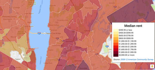 Rental yield visualisation from richblockspoorblocks.com
If you notice, the rental yield search task belongs to an ‘Analyst’ persona. Google is weak in servicing such specific search personas. And justifiably so. The web is a big place with many types of users. Google has to cater to them all. It can’t be narrow. It has to offer comprehensive, generic results. If users have specific needs, they'll have to follow up outside Google.
However, you seldom face such Google-scale challenges in your organisation or department. You can cater to small and narrow collections. You can focus on meeting local needs. You can create custom interfaces for specific personas.
To be fair to Google, they rapidly enhance their search results alongside their 10 blue links. For example, a search for ‘Barack Obama’ shows descriptive data alongside page results. Google can do this because it keeps track of a web of data called the ‘knowledge graph’, which it exploits for certain classes of queries.
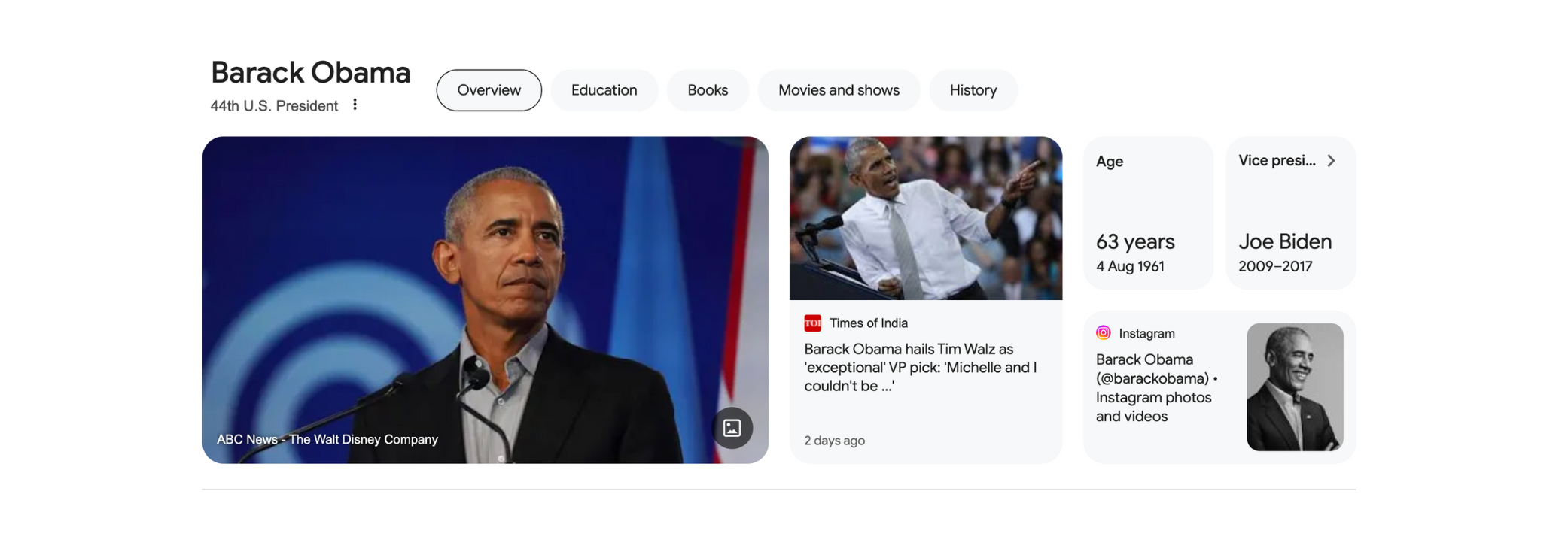
Google’s knowledge graph showing data on Barack Obama
If Google can perform this miracle by sieving through mind-boggling amounts of information, imagine what you can achieve with known use cases and information spanning a project, department, or organisation.
Search interfaces can have many features. The challenge is to select the ones that help in meeting user needs. Max Wilson, author of Search User Interface Design, offers a taxonomy of search interface features:
- Input: Features that allow the searcher to express what they are looking for (e.g., search bar)
- Control: Features that help searchers to modify, refine, restrict or expand their Input (e.g., filters)
- Informational: Features that provide results or information about results (e.g., snippets)
- Personalisable: Features that relate specifically to searchers and their past interactions (e.g., bookmarks)
Let’s use this taxonomy to look at modern search interfaces and how they might work in an enterprise setting.
Input
The search bar is the most recognisable input feature. It’s where users express their intent through a search query. However, this query is not a command but more like a conversation. The user gets some suggestions for their query. Based on the suggestions, the user may choose to modify the query. The process repeats until a negotiated query emerges. The eventual outcome, therefore, depends on the quality of the suggestions.
You can leverage many opportunities to offer quality suggestions in an enterprise setting. For example, you can use:
- The user’s profile information, such as role and department
- Queries that the user previously used
- Queries that others in the project group, department or division have used
- Queries that match controlled terms in an enterprise taxonomy
For example, consider an organisation renting office spaces to industrial and commercial clients. When a staff member enters the term “early termination” to analyse precedents or policies relating to early termination of a lease, the query suggestions can be ranked based on the staff member’s department—industrial or commercial—thereby increasing the relevancy to the job at hand.
Imagine if all search interfaces in the enterprise leveraged local knowledge to offer relevant query suggestions - what a boost in productivity such a design could achieve.
The search bar is no longer the only way to express a query. Devices like Amazon’s Echo and Google’s Assistant show you can use voice or text messages to start a search conversation. New AI-enabled search experiences like Perplexity offer multimodal input capabilities using text, documents, pictures and sound. It is only a matter of time before employees start demanding such experiences in their organisations. As with the search bar, the success of such technologies will depend on how well they address local, specific queries.
Control
Faceted navigation is the most popular search control feature, especially for structured collections. The technique uses attributes or dimensions of content, known as facets, to narrow the set of results.
For example, you might be looking for a mobile phone, in which case Amazon shows you the entire catalogue. But then you spot a dimension or facet called “Item weight” and suddenly realise it is a feature you want in the phone. Clicking on the link shows only the phones with expandable memory, bringing you closer to your job-to-be-done.
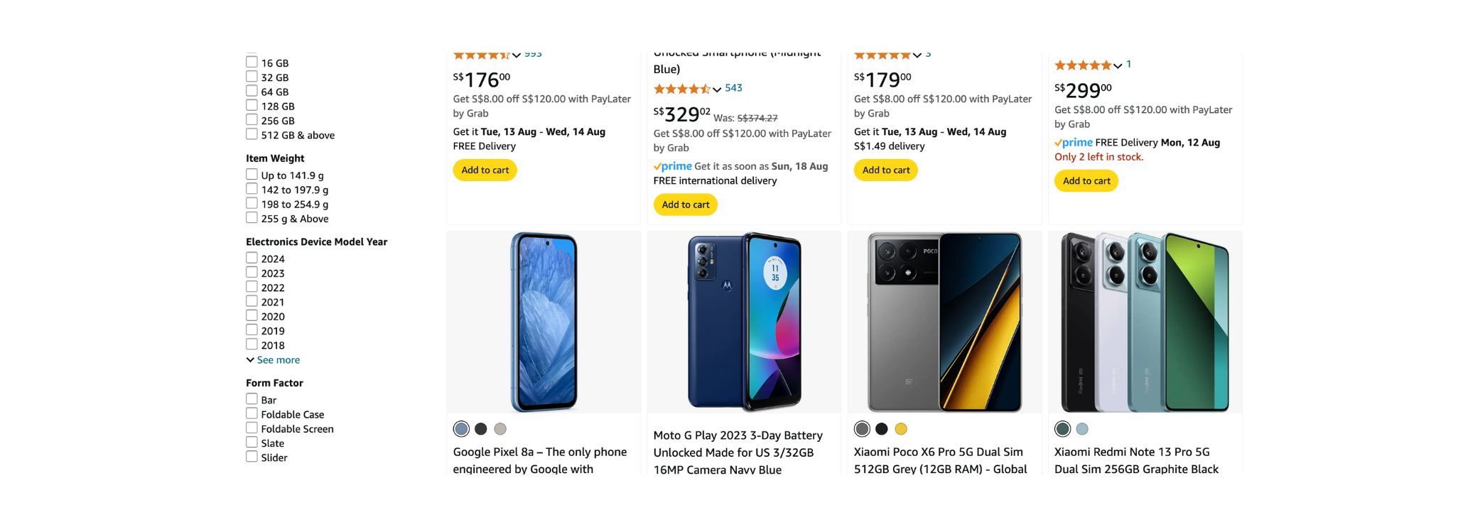
Amazon’s faceted interface
A faceted navigation interface continues the conversation that started with query suggestions. It presents additional terms related to the query and nudges users to make appropriate choices.
As you would expect, the closer the terms are to the job-to-be-done, the higher their relevance. This suggests that faceted navigation cannot be a generic, one-size-fits-all offering. It has to be pertinent to the collection it serves. Enter metadata.
Jeffrey Pomerantz, author of Metadata, describes metadata as “a statement about a potentially informative object”. ‘Item weight’ is a statement about a phone—a potentially informative object to the user. A faceted navigation interface arranges and displays such statements, hoping to release the potential relevancy of the collection to the user.
We will discuss metadata in another chapter. But for now, if you use local search and gather the correct metadata on a collection-by-collection basis, you can offer high-performing, faceted navigation interfaces across the organisation.
Informational
There are many informational components out there. We will focus on two that are useful in an enterprise context:
- Results snippets
- Answer snippets
Result snippets
Only three items were shown on a search results snippet for a long time: the resource's title, description, and URL. But this practice is ending, and thankfully so. The argument for its demise is simple:every search result snippet should have the opportunity to ‘market’ its relevance to the user.
For example, how can a snippet for a bank’s branch office market its relevance to the user? Well, it can show the location, opening hours, if the branch is currently open, and perhaps the ability to reserve a place in the queue. Such a snippet is called a rich results snippet.
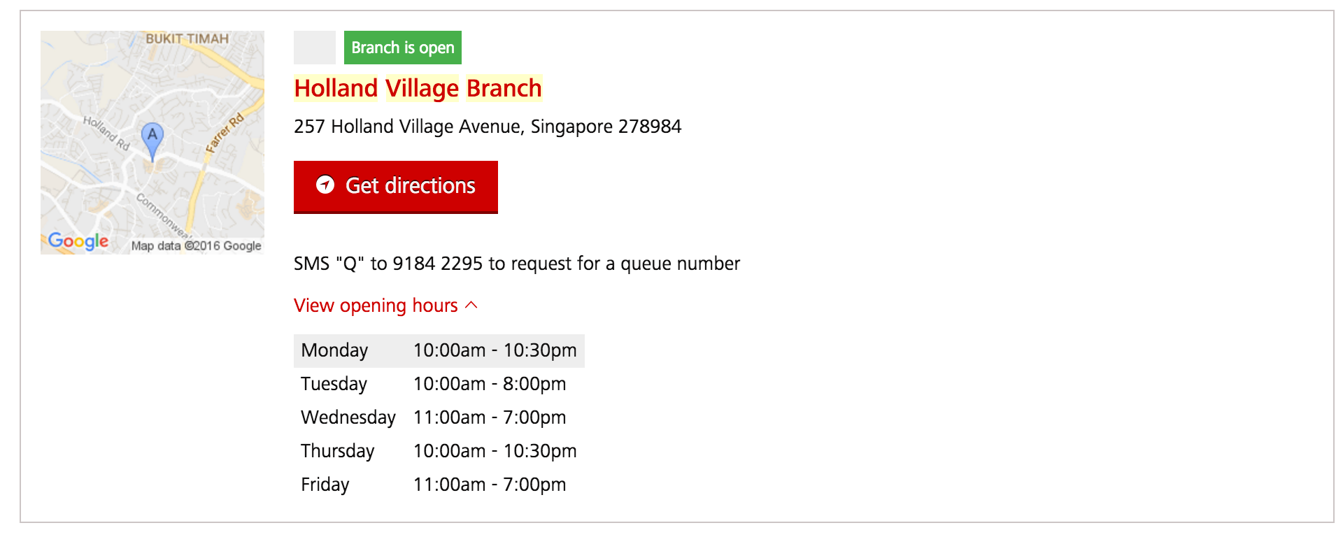
A bank’s rich snippet for branch offices
Going by the above argument, each content type or collection can have a unique rich snippet designed to market its relevance.
Imagine how effective a search could be if content types such as budget papers, proposals, invoices, cases, project docs, etc., used rich information to market their relevance. Imagine if data tables marketed their relevance not as Excel downloads but as charts showing pertinent information.
Answer snippets
Answer snippets respond to direct, factual queries such as “Who is Barack Obama?” or “What is the capital of India?” They appear above the search results list and cater to the ‘Assistant’ persona, who demands fast, direct answers.
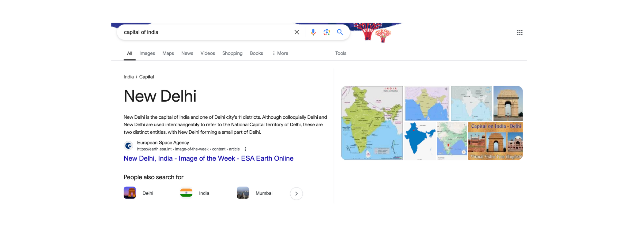
Answer snippet
Google’s answer snippets, called 'Rich Answers', use its vast knowledge graph to suggest answers. You could use a similar tactic in the enterprise. The first step is to understand what answers users want. Then, you need a systematic way of collecting and integrating these answers with the search index. With such a system, your users can start seeing answers to questions like:
- Who is John Paul? (results from the staff directory)
- Who is on leave today? (results from the HR system)
- What projects are underway? (results from the project management system)
Many users want quick facts and answers, so Google’s Rich Answers appear on more than 25% of the queries. A similar situation can be argued to exist in enterprise settings. Therefore, offering rich snippets and answers is an efficient way to raise productivity and satisfaction levels by instantly responding to such requests.
One can imagine how rich snippets will fare with GenAI in the mix. The AI can figure out the best multi-modal snippet for the result and generate it on the fly.
Personalisable
Personalisable features amplify the search experience for returning users.
Three common features that cater to repeat use are:
- Bookmarks: Users can retrieve frequently used results from a single place.
- Search history: Let users refer to or revisit previous queries.
- Recommendations: Entice users to explore related resources they might not otherwise attempt. The recommendations are based on the user's browsing or interaction patterns.
Personalisable features can boost productivity and satisfaction levels in the enterprise. Yes, they require some plumbing to get right, but they are worth every effort.
There are many interface components and many ways to design them. Peter Morville’s Search Patterns and Marti Hearst’s Search User Interfaces are a testament to the breadth and depth of this challenge. The key takeaway is that there is no such thing as a default or out-of-the-box search interface. Every aspect of the interface must be designed to meet specific user needs.